Supercharge Your Website and Improve Conversion Rates via Responsive Web Design

Designing a responsive layout has become essential as most users now browse sites using handheld devices.
A byword for web design, ‘responsive’ basically refers to the accommodation of screen size, resolution and orientation of a website based on the user’s behaviour and environment. The concept of responsive web design means that even as a user switches from a computer to a tablet, the site’s layout changes, so you won’t have to zoom everything using your fingertips on mobile!
Without the need for redirects, users can also access the content he or she wants to look at, as quickly as possible. Here are some tricks to render your website for any browser width and to create a mobile responsive website:
1. Media query techniques
These include changes to the body content, images, media and navigation menus, affecting how the content displays, etc. For instance, images adjust and load properly according to the size screen. Media query techniques are one way you can design and test if your site has implemented responsive web design. This tool not only allows developers to run tests, but is also a simple filter that can be applied to CSS style using common attributes such as height, width and aspect ratio.

In this example, @media specifies the target media types of a set of statements. The min-width and max-width features are telling the browser to automatically adjust margins for screen sizes larger than 1200px and smaller than 960px.
For example, a single-column layout is used for narrow-screen mobile devices while larger screens might implement the same content in two columns, as seen in the sample below.
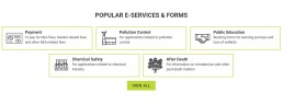
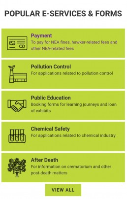
Credits: NEA Website
2. Flexible grids
Flexible or fluid grids allow you to define pixel-based dimensions, so that your layout can adjust for various screen sizes and orientations based on percentage-based calculations. You don’t have to know the exact technicalities, but just that everything is optimised in order for users to enjoy a consistent experience across web and mobile!
Such a fluid layout also saves web developers time and effort when creating the mobile version of the website, and they can also make updates to one site instead of two – making it much faster when implementing updates.
3. Loading speed
Given that consumers have low attention spans, the loading times for your website should rank high on your priority list, as it affects conversion rates and thus your bottomline directly! In fact, research has shown that even a one-second delay makes a difference, as webpages that load in 2 seconds have an average of 9% bounce rate, whereas pages that load in 5 seconds have a much higher 38% bounce rate.
• Image compression
Instead of removing images altogether, developers can try to optimise images by compressing them into smaller sizes while still retaining their quality. This is especially crucial for e-commerce sites for which images are a must.
• Avoid obscure typefaces
Another tip is avoiding the use of obscure fonts, which may slow down loading speeds, implementing caching techniques on relevant parts of your website so users are served the cached content directly.
• Minification
It is also recommended that web developers minify and combine their Javascript files for better page load speed.
Responsive web design makes much sense from a price standpoint! With a seamless experience on any device, your page visitors can enjoy a better experience across a variety of mobile and desktop web browsers.